
Yes, you can add multiple payment links to one link-in-bio page by giving each checkout, subscription or payment destination its own button. The page brings those links together; payment processing, receipts and access remain with the services behind the links unless you specifically use an integrated checkout.
TL;DR
- Can you add multiple payment links to one link in bio page? Yes—give each payment destination a clearly labeled button.
- AkaMe fits creators who want a personalized creator website linking to subscriptions, products or services hosted elsewhere.
- A custom domain identifies your creator website; it does not combine separate checkouts into one cart.
- Test every payment destination on mobile before publishing your link-in-bio page.
Can you add multiple payment links to one link in bio page?
Yes. Multiple payment links can sit on the same page without sharing a checkout. You can direct visitors to a subscription, a digital product, a service booking or another payment destination, provided your page builder supports adding the links and each destination permits your intended use.
For a branded starting point, AkaMe brings important creator links together on a personalized website with a unique domain. The website acts as the front door, while your existing destinations handle what happens after a visitor chooses a button.
Set up the page in this order:
- Collect destinations. Copy the customer-facing URL for every offer you want to include. Avoid account dashboards, private previews and links that require your administrator login.
- Match each offer. Give each button a distinct purpose. A subscription button and a product button should not leave visitors guessing which checkout they will reach.
- Choose a priority. Put your main action first, then arrange supporting options below it. Keep nonpayment links visually separate where your builder allows it.
- Test the journey. Open each button as a visitor, confirm the offer and check the destination on mobile before publishing.
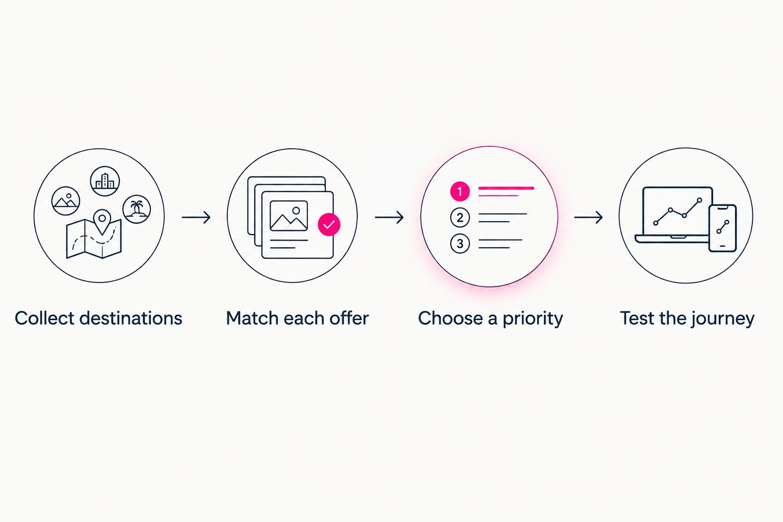
Each button needs a clear purpose and a checked destination before you publish.
Those steps describe a linking workflow, not a payment integration. Adding a checkout URL does not automatically connect customer records, subscriptions or order management between services.
Why this matters
Your social profile has to introduce your work, explain your offer and direct people somewhere useful. A link-in-bio page gives those destinations a shared home without requiring you to move every offer into the same selling platform.
For your 2026 creator website, start with the visitor's task rather than your list of accounts. Someone looking for a subscription should find that action immediately, without reading through unrelated business links.
One page can organize several offers. It does not need to make those offers look identical. Clear distinctions help visitors understand whether they are joining, buying, booking or making a voluntary payment.
Which payment destinations belong on the page?
Choose links based on what visitors can actually do after opening them. Different destinations serve different purposes, even when each eventually involves a payment.
| Destination | Best for | What the button should explain | What to check |
|---|---|---|---|
| Subscription page | Recurring access or membership | What visitors are joining | Billing terms and access details appear at the destination |
| Product checkout | A specific digital or physical item | What visitors are buying | The correct item opens, not an unrelated storefront |
| Booking page | Appointments or services | What visitors can book | The service and booking requirements are clear |
| Tip or support page | Voluntary support | That the payment is optional | The destination does not imply an included purchase |
| Storefront | Browsing several offers | That visitors will browse before choosing | Categories and product information are understandable |
These are destination types, not a claim that every link-in-bio website builder processes each payment itself. A normal outbound button sends visitors to another page; embedded checkout requires separate support.
For example, an OnlyFans creator can use a subscription destination alongside a separate product or service destination. Label each accurately, and follow the requirements of the social network, website builder and destination involved. A custom domain does not override those requirements.
How should you label multiple payment buttons?
Name the action and the offer, not just the payment method. A label such as Buy my editing guide explains more than Pay here. Likewise, Book a consultation sets a clearer expectation than Payment link.
Use this pattern for your 2026 page: an action verb followed by the thing a visitor receives. Only describe offers that actually exist, and avoid promising immediate access unless the destination provides it.
Useful label patterns include:
- Join my membership: for a recurring membership destination.
- Buy my guide: for a specific guide checkout.
- Book a session: for a service booking destination.
- Browse my shop: for a storefront rather than a single checkout.
- Support my work: for optional support without an implied purchase.
Payment-provider names can be secondary context when they help visitors recognize the destination. They should not replace the explanation of what the payment is for.
If you offer different payment methods for the same item, make that relationship explicit. Otherwise, visitors can mistake alternate checkout routes for separate products or assume they need to complete both.
Why payment-link setup varies
There is no single layout that suits every creator. The right structure depends on the offers and destinations you already use, not on filling every available space on the page.
- Offer type: A membership, a product and a consultation need different explanations.
- Visitor intent: New followers need context; returning customers often need a direct route to a familiar action.
- Destination behavior: A storefront requires browsing, while a specific checkout takes visitors closer to a defined purchase.
- Billing structure: Recurring and one-time payments should be distinguishable before visitors reach checkout.
- Page purpose: A sales-focused page needs a different order from a creator website that also handles business inquiries.
- Builder controls: Available link editing, grouping and presentation controls determine how you arrange the page.
Treat these as selection criteria, not reasons to add more tools. Start with the destinations you genuinely need and remove links that no longer serve a clear purpose.
Choosing the right fit
AkaMe is best for creators who want a personalized website linking to offers hosted on other platforms. Its focus is a recognizable destination on a unique domain, with registration and publishing handled for the creator.
Customization, photo selection assistance and a preview before checkout help you shape that destination before committing. Photo assistance supports your judgment; you still decide which images represent your work.
The fit question is straightforward: do you need a branded front door for existing offers, or do you need a system that runs the transactions themselves? If you require a shared cart, order management or payment processing inside the page, assess those requirements separately from its ability to display links.
Carrd suits creators who prefer direct control over website building and domain configuration. That workflow gives hands-on builders a different starting point from a managed creator-website setup.
For a 2026 decision, prioritize the workflow you want to maintain. A long feature list matters less than being able to explain your offers, update their destinations and recognize which service handles each customer interaction.
What should you check before sending visitors to checkout?
Check the full journey, not just whether a button opens. A working link can still lead to the wrong offer, an expired campaign or a page that expects the visitor to already have an account.
Start by opening the destination in a private browsing session while signed out of your creator account. Confirm that the public page explains the offer and identifies the seller or recipient clearly enough for a visitor to understand the transaction.
When your offers include custom work, paying for custom content safely starts with making the deliverable, payment destination and relevant terms clear before anyone pays. Your button should lead to that context rather than ask visitors to send money without understanding the arrangement.
Use a short prelaunch checklist:
- Confirm the destination belongs to the intended account.
- Match the button wording to the offer shown after opening it.
- Check that recurring billing is explained where applicable.
- Make cancellation, refund or service terms accessible at the relevant destination.
- Avoid putting private invoices or customer-specific payment requests on a public page.
- Confirm where customers should go for order or payment support.
A custom domain identifies your front door; it does not verify every destination behind it. Keep that distinction in mind when reviewing links supplied by collaborators or third parties.
How do you test multiple payment links on mobile?
Open your published creator website on a phone and follow every payment button. Do this from the same social app your audience uses as well as from a regular browser, because the browsing context can differ.
Check whether button labels are readable, whether the intended offer appears and whether required sign-in instructions make sense. You do not need to make a live purchase simply to confirm that a link reaches the correct public destination.
If a destination fails, copy the public URL again and compare it with the saved button link. Look for missing characters, an old campaign address or a link copied from an account-management screen.
Repeat the check whenever you change an offer or replace a checkout. Make it part of your 2026 publishing routine rather than assuming a successful launch test covers later edits.
Do multiple payment links create a single shopping cart?
Multiple payment links do not create a single shopping cart. If the buttons lead to separate services, customers follow those services' individual checkout processes.
If buying several items together matters to your business, use a destination that supports that purchasing workflow and link to it clearly. Do not describe separate checkout buttons as a combined cart.
Can you keep using your existing selling platforms?
You can keep your existing selling destinations and link to them from a creator website. Bringing the links together does not, by itself, move subscriptions, customer accounts or purchases between platforms.
That separation is useful when your offers already have a home. Your website organizes discovery while each destination continues its own role.
FAQ
Can I put a subscription link and a product checkout on the same bio page?
Yes. Give the subscription and product checkout separate buttons, with labels that distinguish recurring membership from a product purchase.
Do I need the same payment provider for every button?
No. Separate outbound links can lead to different payment services, subject to the requirements of your builder and each destination.
Can I add different payment methods for the same offer?
Yes, if you have valid destinations for those methods. Make it clear that the buttons are alternative ways to pay for the same offer, not separate purchases.
Does a custom domain process my customers' payments?
No. A custom domain is your website address; the checkout or payment service behind a link handles the transaction unless your website has a separate payment integration.
How many payment links should I put on my creator website?
Include the payment destinations your visitors need, then prioritize the main action. Remove duplicate or outdated links instead of aiming for an arbitrary button count.
Can OnlyFans creators link to other offers from a creator website?
A creator website can organize a subscription destination alongside other offers. Check the rules of every service involved and describe each destination accurately.
Does AkaMe replace my checkout or subscription platform?
AkaMe provides a personalized creator website on a unique domain that brings important links together. Use your existing destinations for subscriptions, products or services rather than assuming the website replaces their transaction tools.
Related guides
- Design a link-in-bio website around one main action
- Check your content creator website on mobile
- Sell digital products from a link-in-bio page
One last thing
Before adding another payment button, ask whether it represents a genuinely different visitor choice. If it duplicates an existing route without explaining the difference, clarify the label or remove the duplicate.
Make the next step obvious. Preview an AkaMe creator website, personalize it around your important links and explore a domain that fits your creator name.